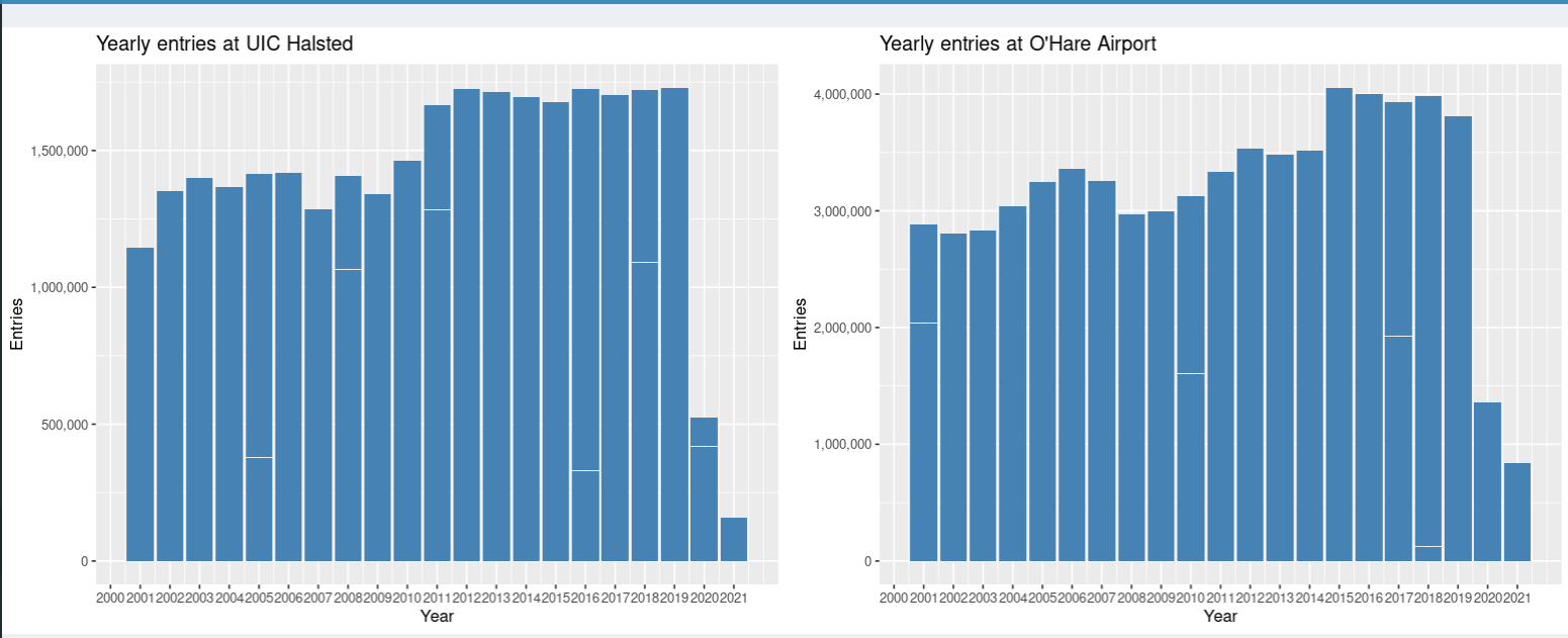
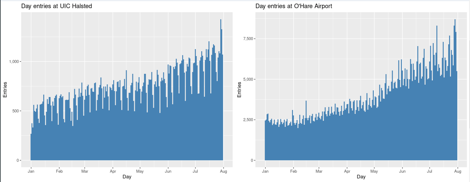
As soon as you open the application we can see a webpage that has two bar graphs. One of the graphs represents Chicago Transit data for the station UIC-Halsted from year 2000-2021 and the other bar graph shows the data for the station O'Hare Airport. The X-axis of the bar graph represents the year which takes values from 2000 to 2021 and in Y-axis gives the number of entries for that particular station for each year.
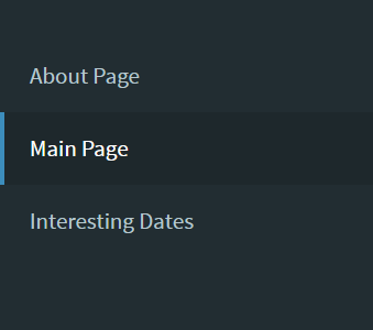
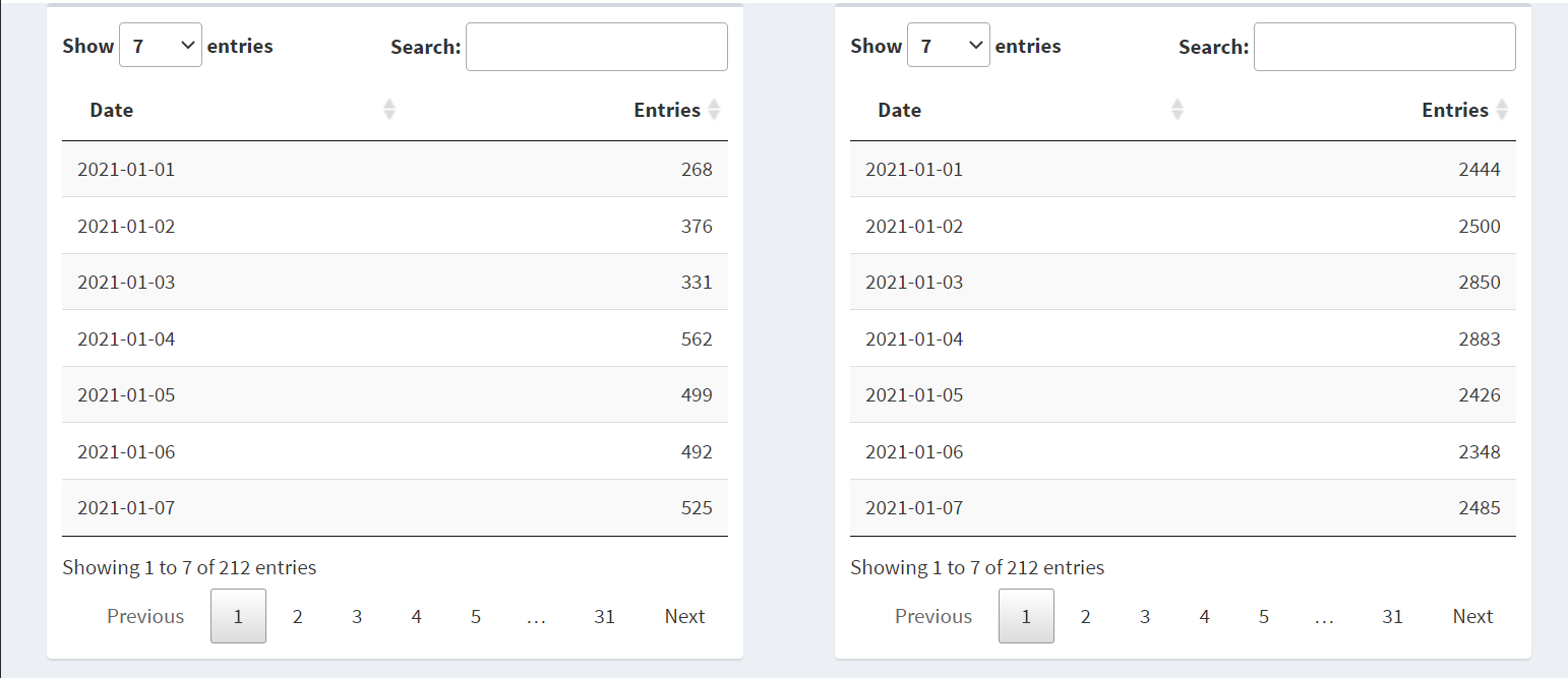
The sidebar contains About Page, Main Page which is the page which is displayed when anyone enters the link, and the third Interesting dates. Each of the sidebar options redirects to a different webpage. About Page contains where the data is collected and what does the data contains and who has written the app. Main Page contains the visualization and tables with dropdowns to select between stations and years and different plot types which can be displayed. Interesting dates page contains 10 interesting dates which show the data around that date and what impact that date had on the cta entries this can seen both in the form of graph and also tabular format.
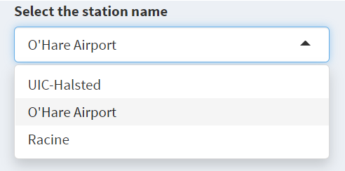
The main page contains two bar graphs on either side of the screen and it contains three dropdowns to manipulate the graphs and the tables. The first two graphs displayed will always display a bar graph with No. of Entries on X-axis and year on Y-axis from 2000 to 2021 but the station displayed can be changed, for this project we have restricted to three stations UIC-Halsted, O'Hare Airport, and Racine. The initial display is set to UIC-Halsted on the left and O'Hare Airport on the right so if we want to change the station there is a dropdown below the graphs called Select the the station which can be used to change the bar graph to the station selected and as soon as you change we can see the title of the bar graph change to the station selected.
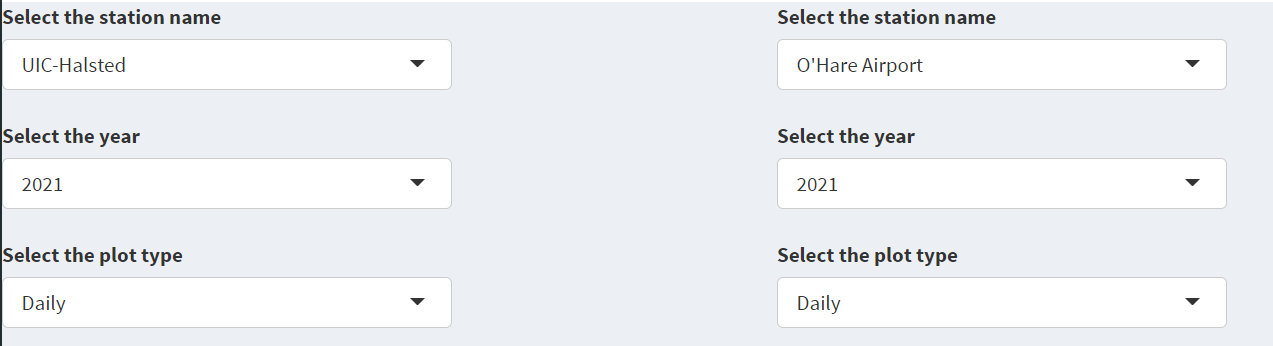
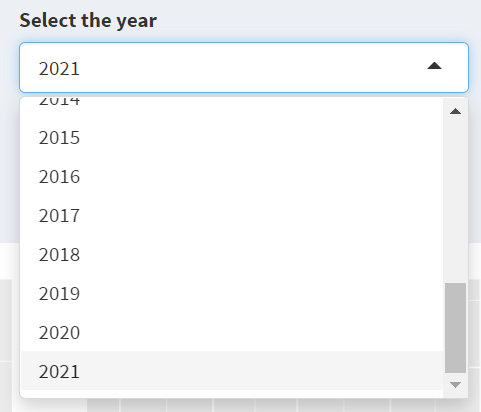
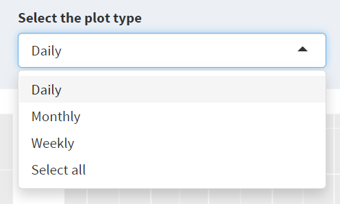
Coming to the bottom half of the screen it has two dropdowns one for Selecting Year and the other for Selecting the plot type to be displayed.
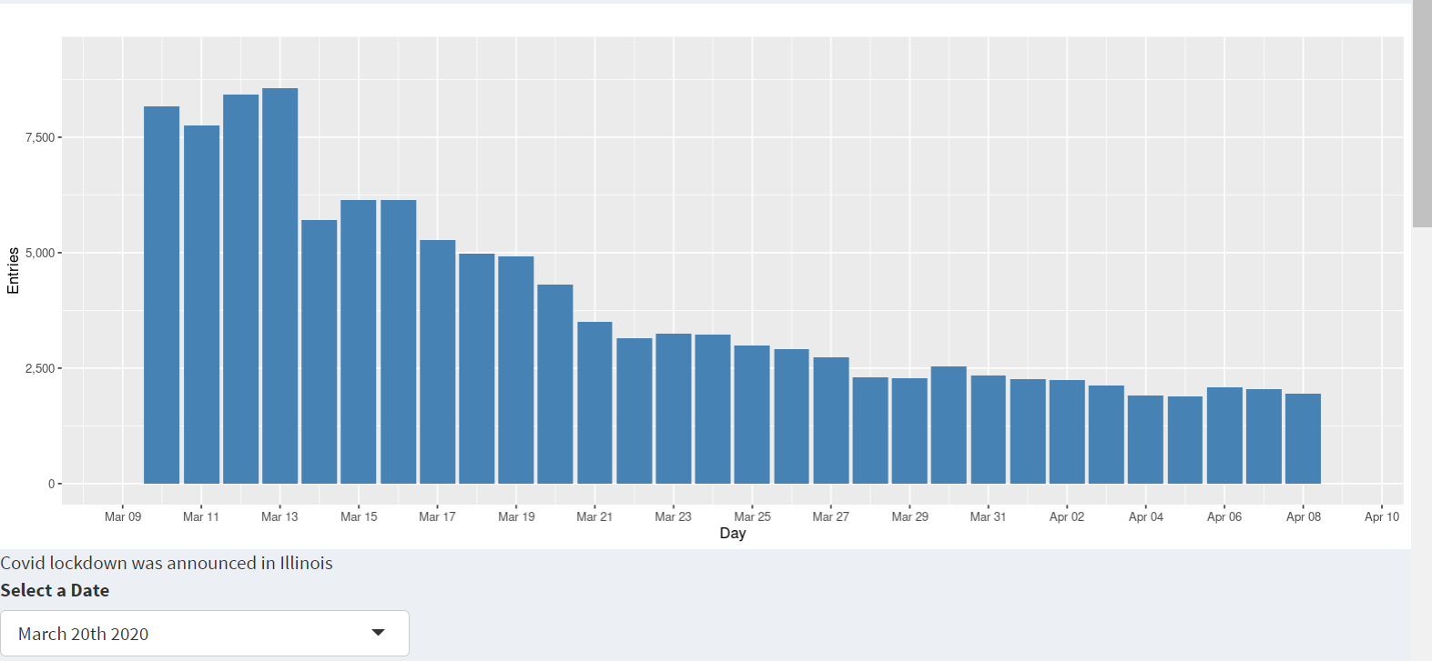
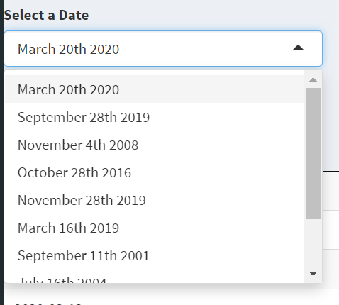
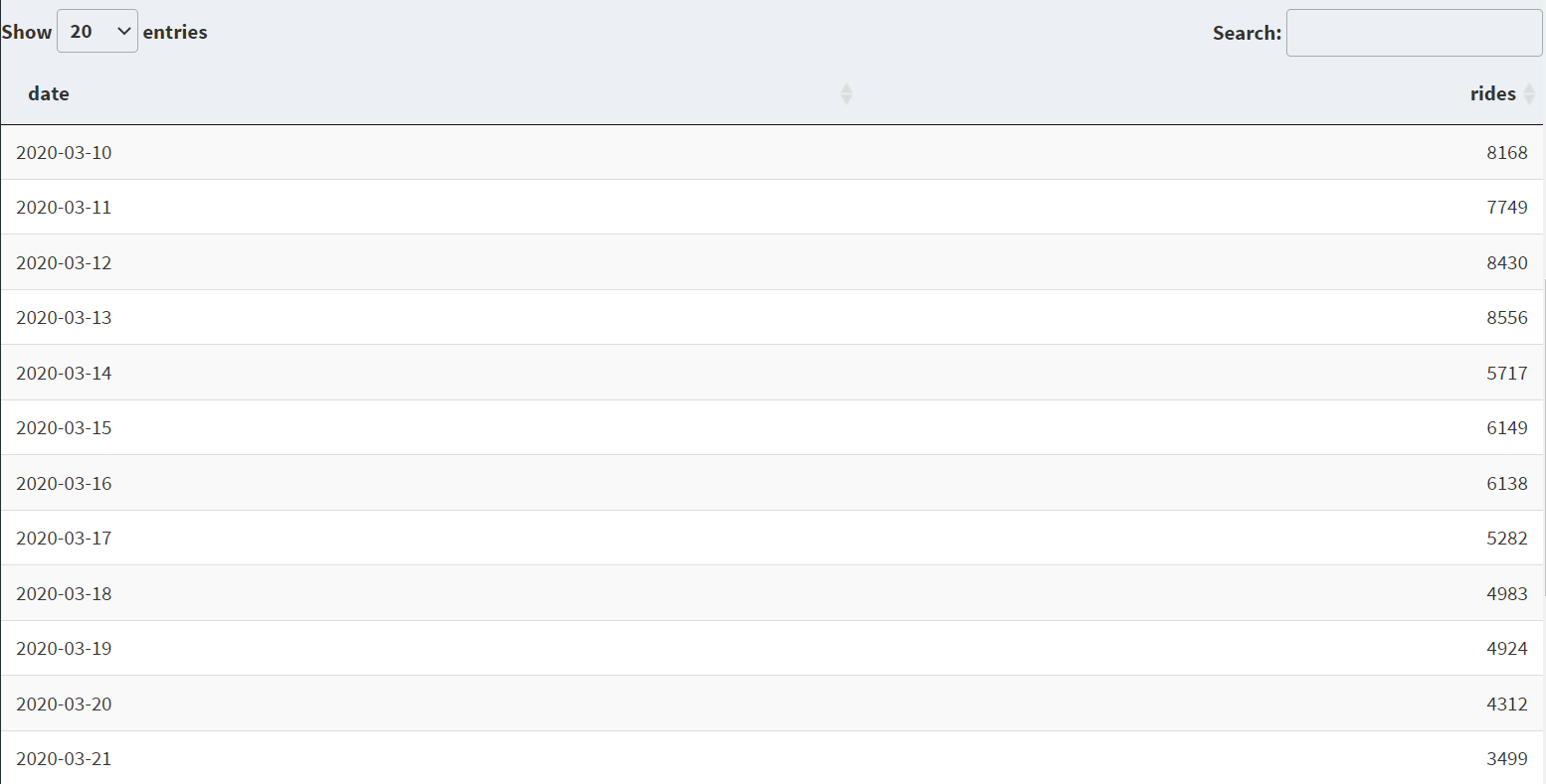
The interesting dates page has one bar graph which displays March 20th 2020 data and it also displays the same data in the form of table. This page can be used to explore data around this dates and what impact they had on the data. It works the same way has main Page the bar graph display changes when selection from the selection dropdown changes and also the corresponding table will also change.